We sell a line of plugins for WordPress including our largest product, WP OAuth Server. WP OAuth Server is a OAuth 2.0 User Authorization plugin and has been our flagship product and service. During our main annual review of sales, we notice that there was room to improve our conversion funnel. Our conversion funnel at the time used simple logic. The logic was like putting a product in a store front window. We put the product out there for the public and we sold that product with support.
Our conversion funnel at the time was:
- Acquisition
- Demonstrating
- Create Desire and Make the Sale
Breakdown of Our Conversion Funnel
Our Acquisition of new clients mainly came to us via organic search results. People would find our website through blogs, documentation and support threads. This was great as we was seeing a large amount of traffic coming in. our daily visitors was around 8K. Once we had the users in the site, we would then show them what WP OAuth Server could do for them by demonstrating through documentation and blog posts. This, at the time, was good enough to create desire and make the sale.
One key thing to note about the last sentence above is “at the time, was good enough“. During the review of sales, we noticed that third funnel process (create desire and make the sale) had a smaller number of customers completing the sale then we created desire. We discovered that we had roughly a 12% shopping cart abandonment rate. This fact was leading something that we had overlooked for 3 years.
“OMG!!! We needed a new approach”
At the time, this was a big development. Calculations put the loss at 5K in annual revenue! Running a small business this can determine if the lights stay on or not. We also noticed that our demonstrating step of our funnel needed to be tweaked as well. Our conversion funnel placed a potential customer in the demonstration phase once they landed on the product page. At what point all they had to do is click the checkout button and they would be taken to the checkout page. Looking at our funnel and our site we came up with a plan to streamline the process and increase our conversion rate throughout the funnel.
The New and Improved Checkout Process
Improvement of our Return Policy visibility
Our return policy is very generous. We offer a 40 day 100% money back return. The issue was that we did not display this very well. We created simple call out on the product landing page right next to the checkout button. This would ensure that our customers know they are covered and not stuck after purchasing.
Simplified Callouts
We removed any and all distractions that pointed away from the product landing page. We increased our checkout button size and changed the color from blue to a nice red. This help the user naturally find the checkout button. The color red also triggers a form of urgency.
Removed all menus on the checkout page
This may seem like to might make the customer feel trapped but in reality it is like a distraction free editor. Any and all links that called for the user to go somewhere else on the site was removed from the page. At this point in the funnel, our customers have committed to making the purchase.
Merged account creation into checkout
We merged our account creation for new customers into the checkout form. We then create an account for them after they have made the purchase using the email they provided. We also logged them into their account after the purchase. This eliminated the confusing and support tickets in the system.
Conclusion
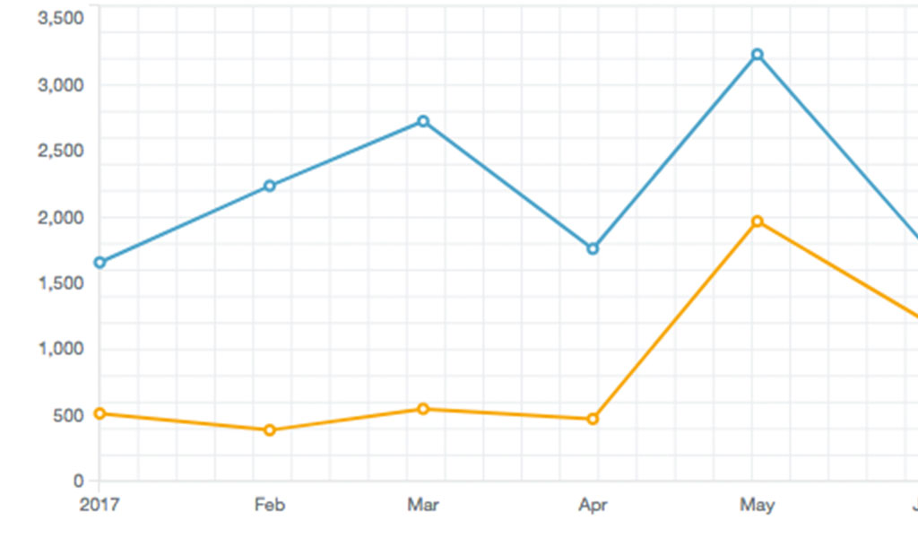
After 8 months of sales we have increased our sales 50% and decreased our shopping cart abandonment rate to 2%. By taking the simple steps above and optimizing your site to match your conversion funnel, we increase your sales and profit.